Painless Responsive Tables
Share This
Introduction
As anyone in the industry today will tell you, HTML tables have become persona non grata in modern web development. After their overuse in page layout at the turn of the century they've become a sore spot for many developers who still spend hours updating these old sites to HTML5 semantic elements. Even when used for their intended purpose to display tabular data they're cumbersome to code, and don't play well with our gracefully structured responsive layouts.
Tables can be a powerful tool for displaying organized and relevant data in easily palatable chunks. They’re also, as their name indicates, the right semantic choice for tabular data such as timetables and complex numeric data. It’s time to bring them up to modern web standards and code them to respond smoothly to different browser widths and devices — ideally without the necessity of an external plugin.
Both equally unreadable.
Unfortunately there’s not one comprehensive solution for responsive tables. The method you choose will depend heavily on the dataset you’re working with. Here, at Web Advanced, we have a passion for creating fresh approaches to aging experiences. We’ve prepared two options we believe will aid you in your quest, and hopefully make your experience working with tables a little less painful. The first is the Horizontal Scroll method, which allows your user to easily compare values between cells with a horizontal scroll that won’t break your layout. The second is the Stacking Method, which reorganizes your content to maintain the relationship between the data and its column heading without horizontal scrolling.
Horizontal Scroll Method
This method has so far been the most ubiquitous across frontend frameworks such as Foundation and Bootstrap, mostly likely because of it’s simplicity.
See the Pen Basic Responsive Table by WebAdvanced (@WebAdvanced) on CodePen.
This method wraps the table in a responsive wrapper with overflow set to auto, allowing the table to remain full-width beneath it and scroll from left to right within the viewport. We know, scrollbars are ugly, but they serve a very necessary purpose. As per usual there is one browser specific bug to consider. Should you choose to use this option with Fieldsets I highly recommend perusing this stack overflow thread for a width bug fix.
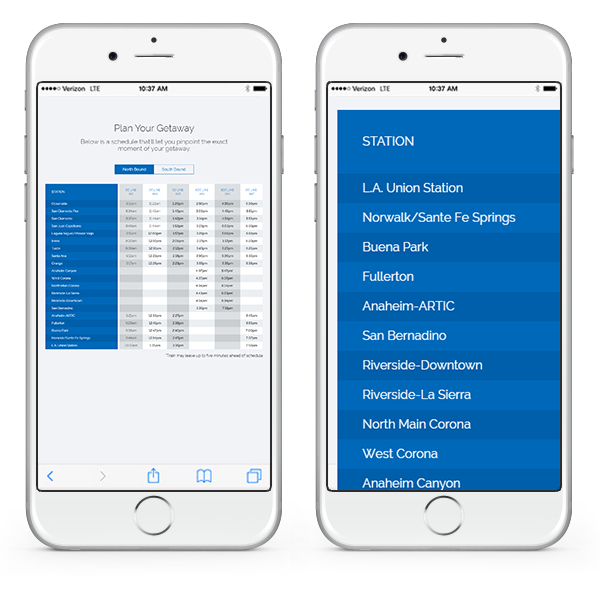
For one of our recent projects for Orange County Transit Authority (OCTA) this method got us 90% of the way there. To kick it up a notch they requested the left column remain fixed while the rest of the table scrolled horizontally beneath it. This allows even the furthermost column to maintain its context by keeping the row header in view at all times.
See the Pen Basic Responsive Table + Persistent First Column by WebAdvanced (@WebAdvanced) on CodePen.
We achieved this with some clever jQuery that duplicates the entire table, removes all content table cells, then loops through each row to ensure the height of the content still impacts the height of the row header. Finally we recursively call the equalizeRowHeights function on window resize to allow content to grow in height and keep its relation to the row header.
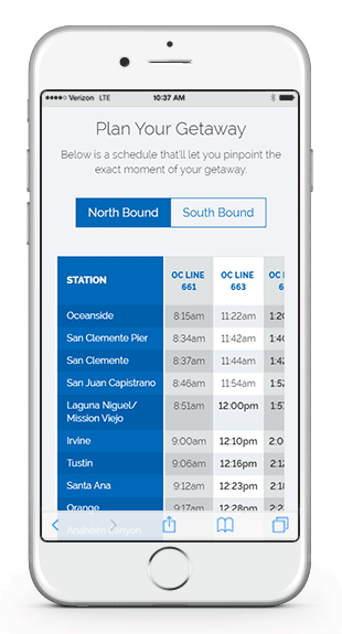

OCTA Reimagining Public Transportation
See How Web Advanced reimagined what a transit website could look like, including tables using this process.
View Case StudyStacking Method
For another one of our recent clients the requirements were a bit different. We were working with more data content and fewer columns, so we decided to explore another option for responsive tables. This method has the added bonus of being purely CSS, no JS required!
See the Pen Stacking Responsive Table by WebAdvanced (@WebAdvanced) on CodePen.
We achieved this using CSS media-queries to sense when the viewport has reached the point where our table would break layout, and reformat the table by adding CSS generated content to a small element (called a ‘pseudo’ element) before each table cell. Utilizing our pseudo elements we can access html data attributes and prepend the column heading, creating a left-hand column for our header and a right hand column for our data at a chosen breakpoint.

Keep in mind, to keep the left and right column layout from breaking with longer value cells on mobile your table content needs to be in an element. This method, while a bit more repetitive, removes the need for horizontal scroll bars and kept our design clean and modern.
Which Should I Choose?
Your choice of responsive tables method depends heavily on your dataset. We applied the horizontal scroll method when we had a great number of columns and rows. Had we applied the stacking method the page would have become unmanageably long even for a mobile users quick swipe. On the other hand if comparing data values between columns was an important functionality the stacking method would make that much more difficult, requiring the user to scroll up and down to compare figures. Keeping in mind your dataset, your clients requirements and the needs of the user base should make your choice much clearer.
With both of these approaches we were pushing ourselves to find a solution utilizing our own code. Tables are a necessary part of web development and in our opinion shouldn’t need a third-party library to conform to modern responsive web standards. But if neither of these options has enough punch for you or you’re looking for something a bit more “plug & play”, there are a number of reputable responsive table plugin options with all the bells and whistles you could ask for.